Home > My Selected Projects 🧑🏾🎨
Home > My Selected Projects 🧑🏾🎨
Home > My Selected Projects 🧑🏾🎨
Manitoba Health App
Manitoba Health App
Manitoba Health App

Overview
Overview
Overview
TThe Manitoba Health App is a self-initiated design project aimed at modernizing the province’s paper-based healthcare system. Inspired by personal frustrations and real-life use cases, the app concept reimagines how residents can manage their health, from checking in at clinics without a physical card to viewing their medical records, booking appointments, and getting timely notifications.
The Manitoba Health App is a self-initiated design project aimed at modernizing the province’s paper-based healthcare system. Inspired by personal frustrations and real-life use cases, the app concept reimagines how residents can manage their health, from checking in at clinics without a physical card to viewing their medical records, booking appointments, and getting timely notifications.
My Roles & Tools
My Roles & Tools
My Roles & Tools
UI/UX Designer
Ideation & Concept Development
Copywriting
Visual Design
Tools:
Figma (Wireframing & High-Fidelity Design)
Google Docs (Notes, Flow Mapping)
UI/UX Designer
Ideation & Concept Development
Copywriting
Visual Design
Tools:
Figma (Wireframing & High-Fidelity Design)
Google Docs (Notes, Flow Mapping)
My Design Process
Ideation & Problem Definition
I started by identifying key pain points:
1. Losing or forgetting physical health cards
2. No central place to view appointments or medical records
3. A lack of digital tools to help manage personal healthcare
This led to the concept of a centralized app to bridge the gap.
User Flow Mapping
I mapped out a simple yet effective flow:
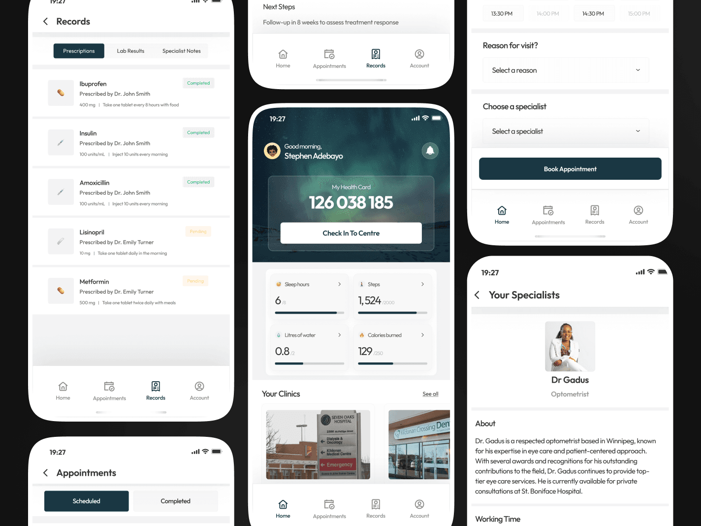
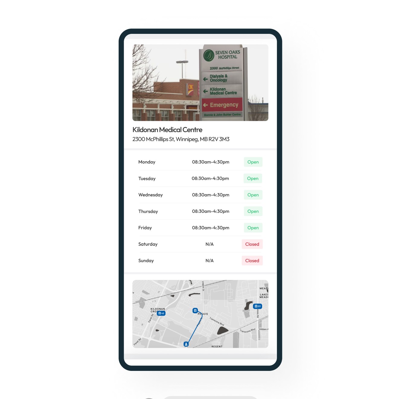
Home – Check-In, Your Clinics, Your Specialists, Upcoming Appointments
Appointments – Scheduled, Completed
Records – Prescriptions, Lab Results, Specialist Notes
Account – Manage personal info, linked health providers, notifications and preferencesLow-Fidelity Wireframes
Basic sketches helped organize the layout and hierarchy before jumping into design.High-Fidelity UI Design
Inspired by the calming beauty of Manitoba’s northern lights, I selected a cool, deep green tone as the primary color, aiming for a professional and approachable feel.Microcopy & Interface Copywriting
I wrote all the interface content to ensure the tone was simple, reassuring, and user-friendly, particularly important in healthcare settings.
Challenges and Observations
Tight timeline: I had to move quickly from concept to design, making fast but thoughtful decisions throughout the process.
Visual clarity: Designing a health-related app meant prioritizing readability, accessibility, and a calming visual experience.
Navigation simplicity: It was important to keep the navigation minimal while still giving users access to multiple features.
Content organization: Deciding how to group and display health data like lab results, prescriptions, and specialist notes took careful planning.
Tone of voice: Crafting language that felt warm, informative, and non-intimidating required extra attention, especially for users who may be anxious about their health.
Balancing feature sets: Choosing what to include without overwhelming the user helped shape a focused MVP.


My Design Process
My Design Process
Ideation & Problem Definition
I started by identifying key pain points:
1. Losing or forgetting physical health cards
2. No central place to view appointments or medical records
3. A lack of digital tools to help manage personal healthcare
This led to the concept of a centralized app to bridge the gap.
User Flow Mapping
I mapped out a simple yet effective flow:
Home – Check-In, Your Clinics, Your Specialists, Upcoming Appointments
Appointments – Scheduled, Completed
Records – Prescriptions, Lab Results, Specialist Notes
Account – Manage personal info, linked health providers, notifications and preferencesLow-Fidelity Wireframes
Basic sketches helped organize the layout and hierarchy before jumping into design.High-Fidelity UI Design
Inspired by the calming beauty of Manitoba’s northern lights, I selected a cool, deep green tone as the primary color, aiming for a professional and approachable feel.Microcopy & Interface Copywriting
I wrote all the interface content to ensure the tone was simple, reassuring, and user-friendly, particularly important in healthcare settings.
Challenges and Observations
Challenges and Observations
Tight timeline: I had to move quickly from concept to design, making fast but thoughtful decisions throughout the process.
Visual clarity: Designing a health-related app meant prioritizing readability, accessibility, and a calming visual experience.
Navigation simplicity: It was important to keep the navigation minimal while still giving users access to multiple features.
Content organization: Deciding how to group and display health data like lab results, prescriptions, and specialist notes took careful planning.
Tone of voice: Crafting language that felt warm, informative, and non-intimidating required extra attention, especially for users who may be anxious about their health.
Balancing feature sets: Choosing what to include without overwhelming the user helped shape a focused MVP.


(c) Meerin ❤️. 2025
(c) Meerin ❤️. 2025
(c) Meerin ❤️. 2025


